I'm gonna disagree with you there, Lucky. I don't think he'd get shot at for having the wrong graffiti- that's just now how tags work. Tags are location based, so the only way this could be an issue was if he had a gang affiliation on it and then took it into the wrong territory- there is meaning to tags, and just because it's graffiti doesn't mean it's a tag.
As for the chaos- I agree that it breaks up the lines of the bike, but don't agree that it's a bad thing.
Look at this guy- the paint splashing is so bold that it really makes the frame pop:

These next two guys both have very bold, chaotic graphics on the body panels (the places the eye "rests" on), and it brings attention back to the frame- a sort of negative space effect.
Thanks for telling me about the tags.
On both bikes you show I understand, and for me the frame on both bikes is where my eye gets some rest.
The solid silver on the top bike frame and the solid black frame on the bottom bike.
But those bikes have a lot of surface area unlike the CB750 that has no body panels.
All that surface area is a big difference don't you think?
Like when DREAM 750 showed the SUZUKI car with graphics. a lot of surface area.
The only real surface area on the CB750 IS the gas tank.
That top photo of the guy with motorcycle... you have to take into account that mural in the background too. See what I mean. That mural is the chaos and the bike is much calmer .
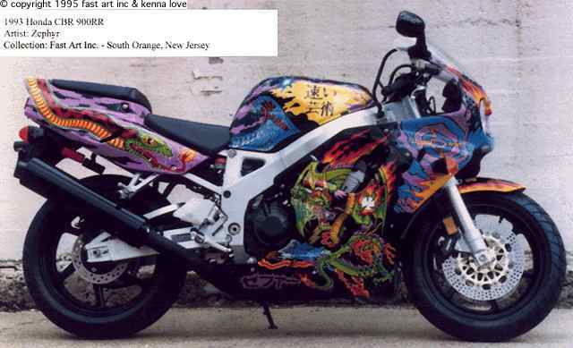
I like the middle photo bike more than the other two.
It has a dragon theme and it all fits together and makes sense.
IT is not what I think of as graffiti. I see it more as a dragon theme design.
Not words.
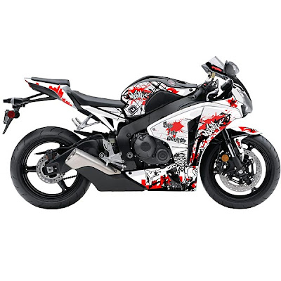
On the top photo, (the first photo) I think the bike would have looked better without the orange. Just the blue and then the green textured part.
When you have a design that is 50%/50% like that your mind keeps flipping back and forth and wants to settle on one or the other. But when you have a design with say 80% one color and the other 20% another color it seems to work better because one color is dominant and there is no fight going on between the two colors.


